Colors are not just mere decorations; they can influence moods, evoke emotions, and even affect perceptions of space and time. When it comes to designing a reception room—the gateway to your home or business—the choice of color is crucial. It sets the tone for visitors’ experiences and can contribute to a welcoming and comfortable ambiance.
Top Warm Colors for a Cozy Reception Room Ambience
Warm colors, like rich reds, vibrant oranges, and sunny yellows, are known for their cozy vibes. They stimulate conversation and create an inviting environment. Imagine walls painted in a buttery yellow or a muted terracotta, offering a cheerful embrace to all who enter the space.
Soothing Sensations: Cool Hues that Transform Reception Spaces
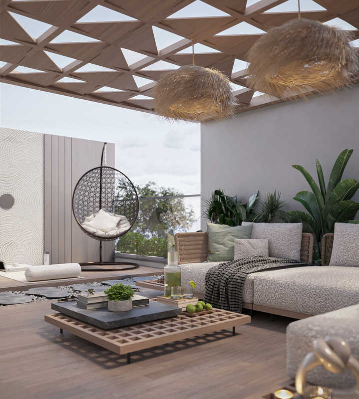
On the opposite side of the color wheel, cool hues like blues, greens, and purples have a soothing effect. They provide a serene backdrop that can make a reception room sigh with tranquility. A pale blue or a soft lavender can transform a busy entryway into a calming retreat.
Read More: Psychology of Green Color in Interior Design
A Spectrum of Welcome: Unveiling the Best Reception Room Color Palettes
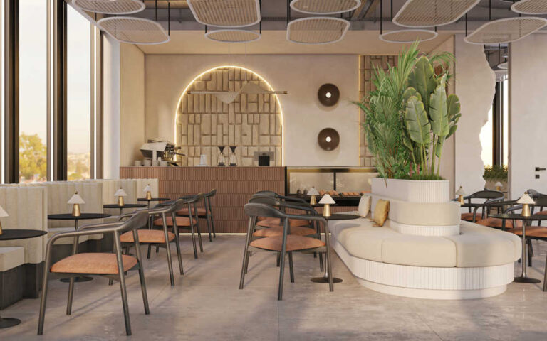
The best reception room palettes mix warmth with calm, often blending neutrals with pops of color. Think of a sandy beige accentuated with oceanic blues, or a gentle grey offset by cheerful coral. These combinations allow for versatility and adaptability in decor.
Chic and Sophisticated: Elegant Colors to Elevate Your Reception Area
Elegance in the reception room can be achieved through deep, sophisticated colors like charcoal, navy, or forest green. These shades speak of prestige and comfort, drawing guests into a reception space that feels refined and classy.
Popular Paint Colors and Current Trends in Reception Room Decor
Staying on trend may involve embracing color shifts each year as dictated by design forecasts. Earthy tones, pastel palettes, or jewel tones may find their way into the most fashionable reception spaces. For those keen on trendsetting, catching the wave of colors like Aegean teal or burnt ochre is key.
Read More: 10 Dental Clinic Interior Design Ideas
Timeless Neutrals: The Best Neutral Colors for Reception Room Elegance
Neutrals are timeless. Shades like creams, taupes, and grays offer flexibility and longevity. A crisp white can serve as a canvas for diverse decorative elements, while deeper neutrals can provide warmth without overpowering the senses.
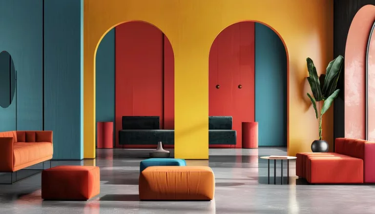
Vibrancy Meets Class: Bright Colors for Lively Reception Room Atmospheres
Bright colors inject energy and vivacity into a space. A striking emerald green or a bold raspberry can infuse the reception area with a dynamic and fashionable flair, ideal for spaces aiming to project creativity and verve.
Pair to Impress: Inspiring Reception Room Color Combinations
Effective color pairing is artful. Navy and gold scream luxury, while blush and grey suggest modernity. By selecting complementary shades, you can create visually appealing and harmonious reception spaces.
Read More: Top Law Firm Interior Design Trends
A Guide to Selecting Inviting Color Schemes for Your Reception Room
Choosing an inviting color scheme involves understanding the room’s natural light, size, and function. Warm, light hues can make smaller spaces feel larger, while deeper colors add intimacy to more spacious rooms. Always consider the psychological effects of the colors chosen.
Drawing Inspiration: Color Ideas that Speak to Reception Room Design
Finding inspiration for reception room colors can come from a variety of sources: nature, art, fashion, or even a favorite rug. Use these inspirations as a springboard to decide on shades that resonate with the essence of the room.
Creating Your Palette: How to Choose the Right Shades for Your Reception Room
Selecting the right colors for your reception space is a blend of personal taste and practicality. Test swatches on walls, observe them at different times of the day, and consider how they coordinate with fixed elements of the room like flooring and furniture.
Read More: 5 Innovative Hospital Interior Design Ideas
How Vera Interior Helps You Choose the Perfect Reception Colour
Vera Interior helps clients select the perfect reception colour by carefully studying the nature of the space, the type of business, and the desired first impression. The team considers lighting conditions, space size, and user experience to ensure the colours enhance comfort and visual appeal. By combining design psychology with modern trends, Vera Interior creates reception areas that feel welcoming, professional, and aligned with the overall interior concept, while ensuring the colours support functionality and brand image.
The choice of color for a reception room is deeply personal yet universally important in crafting a welcoming environment. Whether you opt for trendy hues or timeless classics, the perfect palette is one that reflects the identity of the space and offers a warm reception to everyone who enters.
FAQ
Which colour creates a welcoming reception area?
Soft and neutral colours such as beige, light grey, warm white, and soft earth tones are commonly used to create a welcoming and comfortable reception environment. These colours help visitors feel relaxed and at ease from the moment they arrive.
What are the best reception colours for offices and clinics?
For offices and clinics, calm and professional colours such as white, grey, soft blue, green, and muted neutrals are ideal. These colours promote a sense of cleanliness, trust, and professionalism while maintaining a modern look.
How do colours affect first impressions in reception areas?
Colours play a major role in shaping first impressions. Warm tones can make a space feel inviting, while cool tones create a sense of calm and professionalism. The right colour choice helps communicate the company’s values and sets the tone for the visitor’s experience.
Should reception colours match the brand identity?
Yes, reception colours should reflect and support the brand identity. Using brand-aligned colours helps reinforce recognition, consistency, and a strong professional image while still maintaining balance and comfort within the space.
Why trust Vera Interior for reception area colour selection and design?
Vera Interior is trusted for its design expertise, attention to detail, and understanding of colour psychology. The company ensures that reception colour choices enhance functionality, create a positive first impression, and align perfectly with the brand and overall interior design vision.